Target Size
It’s hard to hit a small target such as a small icon or link in a tiny font size. People with physical disabilities, such as tremors, find it hard to use small buttons that are close together. Anyone can have difficulty selecting small, closely spaced links on a phone. Interactive elements must be big enough to easily select. They must also be far enough from other interactive elements to avoid selecting the wrong target. Larger target areas with adequate space between them make it easier for everyone to select the desired element.
Overview
Section titled “Overview”Have you ever had difficulty selecting a tiny link, such as a footnote in a document? Or struggled to click on one of several closely spaced links, like a single menu item from a list on your phone? The Web Content Accessibility Guidelines (WCAG) target size requirements address both of these problems by ensuring:
- targets are large enough to be easily selected, or
- targets are far enough apart to be easily selected.
WCAG requires elements like links and buttons to be at least 24 by 24 pixels (px) in size. The preferred size is 44 by 44 px. It’s easier for people to select a specific clickable element, also known as a target, when it meets these guidelines. This ease of use is especially valuable for people with motor skill disabilities such as tremors, since larger targets are easier to select. It also helps people with impaired vision, since larger targets are easier to see.
Sometimes targets are smaller than needed. Undersized targets must have enough space between them to help people select the correct target. The undersized target combined with the space around it must equal at least 24x24 px, or, preferably, 44x44 px. This explanation simplifies the target spacing requirements, but it gets the point across.
There are many nuances to the WCAG target requirements. How do you measure the distance between two targets? What if the target is not a square shape? The Guidelines section of this article fully explains the WCAG target requirements.
Who is Helped
Section titled “Who is Helped”Target Size primarily helps people with limited fine motor control, or those who experience tremors or spasms. It ensures that the buttons are large enough to easily press, and that they have enough space around them to prevent mistakes.
Other groups that benefit from a larger target and space around targets include people with limited mobility and dexterity. Target Size is useful for people with these specific disabilities because it ensures that the right buttons are activated and the devices they need to use will work well. It also allows users to operate a mobile device more easily. The overall benefit of the correct size and spacing is that everyone will be able to activate the buttons they want and not make the mistake of hitting the wrong one.
Guidelines
Section titled “Guidelines”First, we need to understand the “target”. In web design, a target is any interactive element on a webpage. Buttons, links, and switches are some examples of targets. Why do we call them targets? Because we need to aim to interact with them. The size of a target is important; website creators have to ensure that targets are big enough and have reasonable space around them. Below, we’ll learn about minimum and enhanced target sizes and what to consider to make any target “thumb-friendly”.
Next, we need to know: What are CSS pixels, and why do we use them to measure target sizes? CSS (Cascading Style Sheets) pixels are also known as density-independent CSS pixels, and they don’t change regardless of screen resolution or magnification. We use them in web development to ensure an element looks consistent across different devices. For instance, imagine a circle with a diameter of 24 CSS pixels. When you increase the zoom up to 200 percent, the circle will look larger, but the CSS size of this circle will remain 24 pixels. For more technical details, see the article Understanding pixels and other CSS units.
Web Content Accessibility Guidelines Recommendations
Section titled “Web Content Accessibility Guidelines Recommendations”There are two requirements for assessing the size of a target.
The first requirement, WCAG Success Criterion 2.5.8 Target Size (Minimum), is less strict and allows for smaller targets, though it recommends a minimum target size of 24 by 24 CSS pixels. Do not make your targets small, unless you have a reason (see Exceptions below). Also, below you find some ways to pass this criterion, even if your targets are smaller than 24 pixels, and make them more accessible.
The second requirement, WCAG Success Criterion 2.5.5 Target Size (Enhanced), is stricter and meant for bigger targets. To pass this criterion, an element must be at least 44 by 44 CSS pixels in size. This target size makes operation easier with any pointer device, especially touch screens. You should follow this requirement when your control is:
- often in use;
- not easily reachable (at the edge of the web page, for instance);
- not easily undone;
- a step in a process.
Best practices
Section titled “Best practices”Initial elements should be at least 24 by 24 CSS px with some additional space around for better targeting;
Essential components should be at least 44 by 44 CSS px for essential components.
Proper Measuring
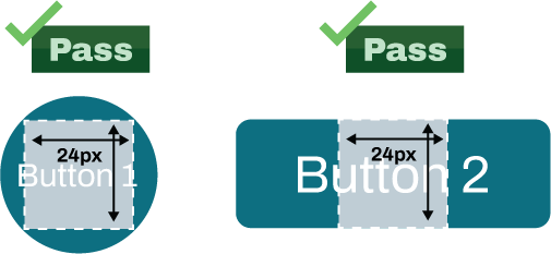
Section titled “Proper Measuring”What should we pay attention to when measuring targets? It’s easy when your targets are mostly rectangles or circles. Figure 1 illustrates how to measure standard-shaped buttons. As you can see below, a 24 px square can fit inside both the circle-shaped button and the rectangle-shaped button. This means that both shapes pass the minimum target size requirement.
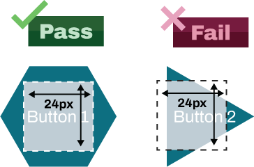
But targets can be any shape. To estimate the size of a non-standard shape, a square with sides measuring 24 pixels must be able to fit inside of the element being measured (see Figure 2). As you can see below, the hexagon-shaped button passes the test, because a 24 px square fits inside of it. The triangle does not pass the test, since the 24 px square cannot fit inside it.
The examples above show how to use a 24 by 24 pixel square to check if a target passes minimum size requirements. You can use the same general method to check if a target passes the enhanced size requirements as well. The only difference will be the size of the square. For enhanced target size, a 44 by 44 px square must fit inside the target.
Exceptions
Section titled “Exceptions”There are some exceptions to the target size rules.
- Equivalent
- If another element with the same functionality already exists on the webpage, only one must follow these recommendations: a minimum of 24 by 24 CSS pixels or an enhanced 44 by 44 CSS pixels. This exception applies to both success criteria.
- Inline
- If the target is a whole sentence inside of a paragraph, it doesn’t have to follow target size rules (see Figure 7 below). This exception exists because targets are limited by line height. Responsive design can make it impossible for target size pointers to work correctly if they are in adjacent lines of a paragraph, since targets in adjacent lines might overlap when activated. The best solution for this problem is to increase the spacing between lines. Links, footnotes, and help icons within a sentence are a few examples of this exception. If the entire block of text acts as an actionable element, though, it must follow target size rules. This is true for both the minimum and the enhanced success criteria.
- User Agent Control
- If a web page designer doesn’t modify controls, they do not need to follow these rules. Browsers usually create accessible controls. This exception applies to both success criteria.
- Essentials
- Some legal documents or applications for art and media content creation may use small targets that cannot be enlarged. Some examples of these are, date pickers, musical notation, or pins on maps. These elements must remain small so that they don’t obscure important details underneath them and become unusable. We consider them essential, so their size remains unchanged.
- Spacing
- Sometimes we cannot change the size of an element. In that case, we can increase the empty spacing around it. The spacing around the elements must be the minimum recommended size of 24 by 24 CSS pixels. To create the spacing, we move the elements apart, making them less crowded. This exception only applies to SC 2.5.8 Target Size (Minimum). The spacing exception is not allowed for the enhanced target size. For the enhanced target size, your element must be at least 44 by 44 CSS pixels and not include any spacing around it.
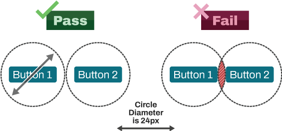
Figure 3 below shows examples of passing and failing the applied spacing exception. To check if an element passes or fails this recommendation, we use a circle with a diameter of 24 pixels. The circle’s center should coincide with the center of the button, and the nearest circles must not intersect. There is more space between the pair of buttons on the left than between the ones on the right. The picture below shows that the first pair of circles does not intersect. This means it passes the spacing exception. The second pair of circles intersect, which is incorrect and indicates that the buttons should be placed further apart.
How to Test
Section titled “How to Test”Testing target size is not straightforward. There are no completely automated tools to test these success criteria. Specialized bookmarklets can be helpful. Bookmarklets are special JavaScript tools that are stored on your browser like a bookmark. Even with a bookmarklet, you’ll still have to check manually to see:
- if targets are excluded;
- if there is enough space around them;
- if the target intersects with other targets nearby.
Below, you will find the testing methodology and some tools that can help you to make your targets more reachable.
Note: It’s important to understand that, of course, you, as a creator, can make a small target size and add spacing around it to meet the required measurements. But you should always ask yourself: Does this decision help make my website better? Does it make the website more accessible?
What are we looking for when testing target size?
When testing target size, you are checking to make sure that:
- The target is 24x24 pixels or larger, OR
- Targets don’t overlap when a circle with a diameter of 24 pixels is drawn around them.
What’s the best process for testing target size?
Here’s a good workflow for testing target size:
-
Identify the interactive components (targets) on the page.
-
You can inspect the target using the browser’s Developer tools.
The box model under layout shows the pixel size of the margin, border, padding, and size of the target you are inspecting. If these add up to be 24 or greater both vertically and horizontally, then the target passes.
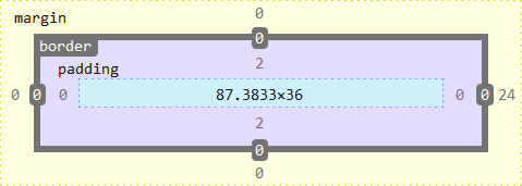
Figure 4: Box Model Developer Tools example A faster way to view this information is to use the web developer extension to view the size of elements:
Information > Display Element Information -
For any targets that are smaller than 24x24 pixels, test whether they have enough space around them so that a user won’t hit another target by accident. Use the target size bookmarklet by Steve Faulkner to test this. When activated, this bookmarklet tests for overlapping targets and then draws 24-diameter circles around the center of all the targets on the page.

Figure 5: Target Size bookmarklet example -
To test for enhanced target size, you can use this 44x44 Cursor Bookmarklet. Once activated, your cursor turns into a black cross with a 44-pixel (px) square around it. You can move the cursor over the interactive elements on the page to verify that they meet the target size requirement. Figure 6 below, the Accessible Community Home page, illustrates how your pointer looks when you apply this bookmarklet. (The 44 by 44 px cursor has a red circle drawn around it).
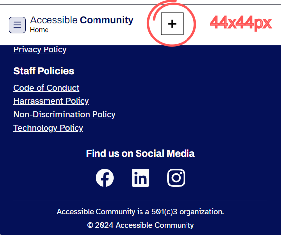
Figure 6: Web Page With Applied 44 by 44 px Target Size Bookmarklet For more information about bookmarklets and how to install and use them, see Single-Purpose Bookmarklets (Tally).
There are some exceptions to the target size requirements:
- Targets that are inline with text (as in Figure 7 below) are exempt because they cannot be taller than the text size. You do not need to test these. Note: The Target Size bookmarklet was applied for demonstration purposes only. We do not need to test this.
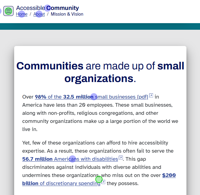
Figure 7: Example of Inline Exception - If two or more targets go to the same place or do the same thing, only one of them needs to pass. Test the one that is most likely to pass first.
- If the small size of the target is needed for the target to work correctly, such as in a game where hitting small targets is the point, then you do not need to test the target size.
- If the target is a default button or checkbox that has not been customized, you don’t need to test it; in most cases, the browser has already made it accessible.
References
Section titled “References”- WCAG Success Criteria 2.5.5 Target Size (Enhanced), Level AAA (W3C)
- Understanding SC 2.5.5 Target Size (Enhanced) (W3C)
- WCAG Success Criteria 2.5.8 Target Size (Minimum), Level AA (W3C)
- Understanding SC 2.5.8 Target Size (Minimum) (W3C)
- Target Size and 2.5.5, Adrian Roselli
- Understanding pixels and other CSS units
- How to test 2.5.8 Target Size (Minimum) by TPGi
- Designing Better Target Sizes, by Ahmad Shadeed
- 44x44 Cursor Bookmarklet, by Adrian Roselli
- Target Size Bookmarklet, by Steve Faulkner